The Beginning of the End

I’m excited to have some works featured in this group show curated by Patrick Bower and Cait Reid of Immaterial Projects.
May 3-May 31, 2025
Saturdays and Sundays, 1-6 pm
Opening: Saturday, May 3, 6-8pm
The Active Space
566 Johnson Avenue, Brooklyn NY

Open Studio Summer 2024
Come to Bushwick for an open studio on July 14, 2024
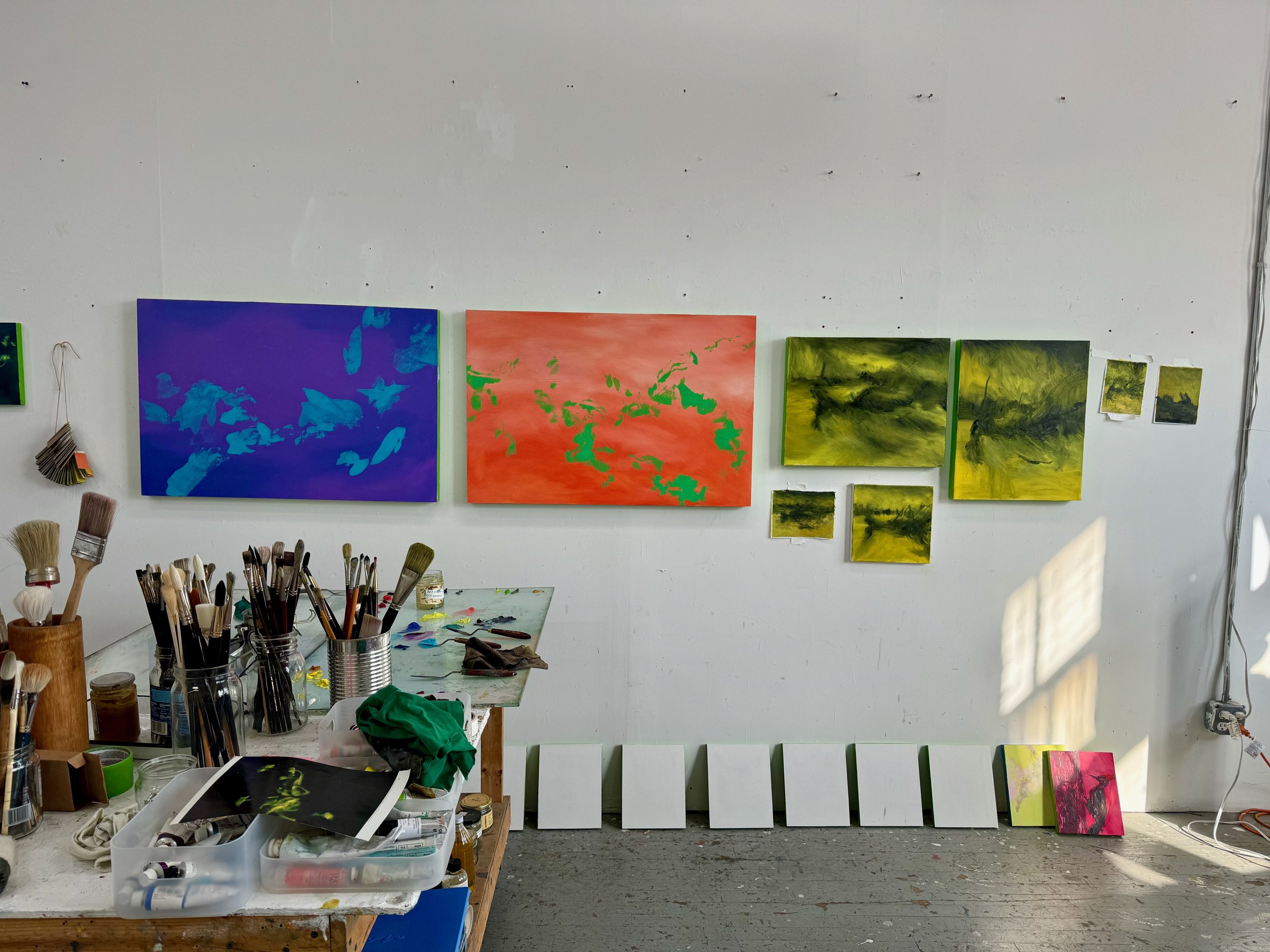
I’ve had a ton of momentum coming out of the Canopy Program, and with that I took the plunge on a (temporary) larger studio space and some focused chunks of time for making. I’d love to share some new work that I’m excited about, so I’m hosting an open studio in July.
Open Studio
Sunday, July 14th
1 – 4 pm
Bushwick, Brooklyn
2 minute walk from the Jefferson L
accessible only by two flights of stairs
Please RSVP to get the address and so I can anticipate how many people are coming.
I’ll be having a studio sale too – works on paper, panel and canvas will be available for purchase in a range of prices. If you’ve seen something on Instagram that you like and it isn’t marked SOLD, it’s available so please reach out if you’d like to inquire about the price or reserve it.

Spring 2023 Shows
A schedule of group shows in spring 2023
When it rains, it pours! I’m in not one, not two, but three group shows in the next month. Over the past year I’ve taken classes through NYC Crit Club, and it’s been a great way of getting my work critiqued and to build community with other artists. It’s also kept me accountable to making work regularly and helped me to articulate my themes more succinctly. And now I’ve got some new work to share.

Experiments on large paper
The Storms Inside
Saturday, April 15 · 6 - 9pm
Triangle Loft
675 Hudson Street #Fl. 5 New York, NY 10014
On view by appointment April 15 - April 29
Storms brew inside of all of us in forms of passion, anger, sadness and bouts of extreme emotion only to be spit back out in the form of art and expression. Join us in exploring and bearing different storms, big and small, and the manifestations that live deep inside us.

Inscapes
Thursday, April 20 · 5 - 7 pm
Studio 9D
516 W. 26th Street #9D New York, NY
On view Friday April 21st 12-5 pm
A group show from artists in NYC Crit Club’s Spring 2023 cohort taught by Sam Bornstein
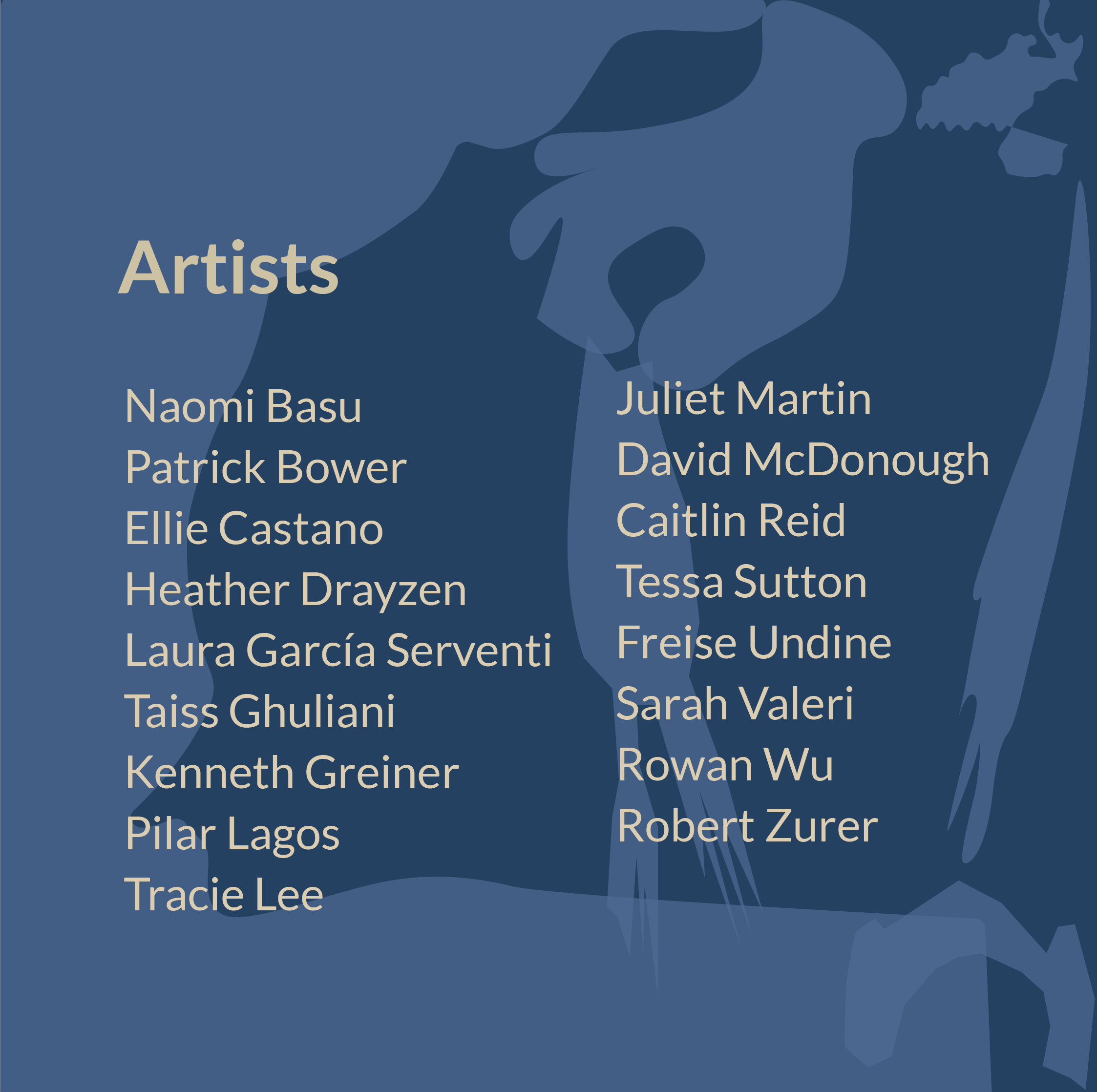
Empathy + Alchemy
Friday, May 12th · 6 - 9 pm
The Living Gallery
1094 Broadway, Brooklyn, NY
A one night pop up featuring 17 artists and curated by me, Naomi Basu, Patrick Bower, Pilar Lagos, Caitlin Reid, and Robert Zurer. Bonus that it’s in my neighborhood. This promises to be a fun time!


Residency Reflections
On attending a residency, what it’s meant for my practice, and coming to terms with my process.

Sunset from the roof of Poco a Poco
Big confession: the Poco a Poco residency is the first "official" residency I've ever done. For years, I've been wanting to do a residency but it's never felt attainable to me because I couldn't picture myself as a "Serious Artist" (i.e., someone who makes a living off of art). And, in my mind, only "Serious Artists" were accepted to residencies. I've had a creative practice for years, where I make things in the in-between spaces of my life. But only in the past three or four years have I been approaching it with more commitment. I love the "flow" that comes with painting and drawing, but it also became urgent to me to use my creative practice to speak about social and political issues.
In 2019, I visited Oaxaca on a vacation and found out about Poco a Poco through their now defunct gallery space. Their residency program really spoke to me because it felt more inclusive of how people approach creativity. It still felt a little intimidating, but it was easier to imagine myself there. So I decided to submit an application. It was an opportunity for me to articulate and synthesize what I had been doing for the past decade or so, and I wasn't expecting to get accepted. But somehow I did.
And then the pandemic hit. I deferred the residency for a year. We talk about silver linings with the pandemic, and this was definitely one of them. Suddenly I had huge blocks of time on my hands in my apartment with no one around and no social obligations. I took the time to participate in intense virtual workshops that changed my relationship with painting and drawing. I had an art book club with friends where we discussed creativity in relation to the Anthropocene. I experimented with how I was making. Volume-wise I've made more work in the past year and half than in the past ten years. The pandemic forced me to reckon with what is important to me and what I was committed to. It shifted my relationship to the residency and what I wanted to get out of it.

Even so, I was ~extremely~ nervous going into it, worrying that I wouldn't be able to make anything or somehow "fail". (What is a "Serious Artist" anyways?! Demons are very real.) I frantically revised my proposal the week before I left (yes that's the overachiever in me).
Once I arrived in Oaxaca, I made a conscious decision to let things unfold, trust my intuition and not force anything. It wasn't about "working hard", where I'm chained to my studio or my desk. I realized it was about making mental and emotional space to let my subconscious make connections. Talking to people, eating, and following my interests down rabbit holes. Trying to attain a state of play, trusting that urge or little tug to make something quickly out of whatever is at hand. Not judging the idea or the thing as I'm making it. And even if I don't "like" it at the end, it doesn't matter because it could lead to something else. It can be reused or recontextualized in the future.

I felt really good about both the process and what I made – the ideas that I explored, the people I met, the places I visited. And how this might germinate into new things. I've struggled with accepting my creative process for a long time. This felt different in that I let my process flow without judgement.
Some realizations:
Sketching/drawing/notating/diagramming is an essential part of my practice. Documentation IS part of the work. For so long I've tried to separate "design" techniques from "art". It's simply a technique, it's how you're using it to communicate and work through ideas.
Conversations with people fuels my subconscious. Even if it has nothing to do with the topic or concept that I think I'm exploring. Everything is interesting and I need a dialogue with others.
I need to generate a lot of work, quickly. I don't know the destination or where I'll arrive, but I can't get there unless my hand is working through the journey.
Going into it, it felt like it was going to be a leap, but coming out of it, I realized that it was a progression of my creative practice over many years. The residency afforded me the time and space to focus on my practice, go deep on concepts, gain confidence in my process, and experiment with media. Being a "Serious Artist" has less to do with making a living off of it, and everything to do with whether I take my own practice seriously.

Chinatown
The term "Chinatown" often conjures stereotypical images of narrow streets filled with people and a colorful riot of signage. But it means so much more than that.
corner of Henry St. and Catherine St.
The term "Chinatown" often conjures stereotypical images of narrow streets filled with people and a colorful riot of signage. But it means so much more than that.
The Chinatown of my childhood meant weekend trips to visit my grandparents, dim sum, grocery shopping, birthdays, weddings, Chinese New Year, egg tarts, steamed lobster. From the mundane moments of filling orange plastic bags with greens at the vegetable stands, to the excitement of getting a white sponge cake to mark a celebration, so much of that Chinatown was filled with family and vivid sense memories.

It wasn't so simple as I grew older. I was influenced by my father's attitude, who has always seen Chinatown as the place to get away from, and the only measure of success was to leave. I was born and raised in the Jersey suburbs so my experience growing up was much more "mall rat" than "street smart". So I struggled with feeling simultaneously an outsider to Chinatown because I hadn't been a resident with added language/class/education barriers, while feeling deeply connected to a place I've been going to regularly all my life.
As an adult, I realized how important Chinatown was to me, and I've been excited about the ways that it's changed and grown. But I've also been increasingly concerned about the effects of gentrification and how it impacts older generations and the unique culture. My connection is mainly through my family and regular visits to my grandmother, and I had been thinking about how my tenuous connection to Chinatown will change when my grandmother inevitably passes away. I wanted to find a way to participate, but so many organizations didn't feel like the right place for me because of the complexities of identity, and the shame in not feeling "authentic", that I was navigating.
And it's around that time that I found out about Wing On Wo. It seems like I've always walked by a stretch of Mott Street where Wing On Wo sits, catty corner from the Catholic school that my dad attended as a kid, on my way to somewhere else. I hadn't specifically ever noticed the shop, it's one of many that make up the fabric of Chinatown. Mei's efforts to save her family's business and found the W.O.W. project put that bit of Mott Street into a whole different light. It was like the beginning of the Wizard of Oz when Dorothy goes from a black and white world into Technicolor. W.O.W. brought up and articulated so many of the complex feelings and concerns that I had about Chinatown and my relationship to it.
Feeling this resonance led to my first donation to the W.O.W. Project to support their programs. I popped into the shop to pick up my donor "reward", and I had a long chat with Gary, Mei's dad, who helps run the shop. Turns out he went to the same Catholic school as my dad, a few years apart. Suddenly I felt a connection; Chinatown was more than a place, it became an opportunity for community.

A Ten Year Tea
The experience of drinking a ten year old pu-erh tea
Living in a small apartment means tight constraints, so I constantly shuffle objects to find the exact right place for them. It's like a reverse Marie Kondo, and I ask objects if that's where they need to be. For a time, a particular object might have the proper resting spot, but then I might lose track of it. For years. In the great and slow reshuffling of all the objects, they can reappear seemingly from thin air at just the right moment.
During social isolation, I've found myself doing more shuffling than usual to help reconsider the space I already have available to me. I removed a snag of cables, a blanket and a broken alarm clock from the shelves of a massive dresser that I inherited from my grandmother. In the very back I pulled out a pu-erh tea cake, and I realized that it's been exactly ten years since my first (and last) visit to China.

Tea dealer in Beijing
So many feelings and memories came back to me. I was taken to the moment when I bought the pu-erh from a tea dealer in Beijing, how I sampled all of these different teas from Yunnan with friends, and talked with the tea dealer about the tea making process. I was deeply appreciative to have that experience. But I also remembered how strange it felt to be in China, and it was a real shock from what I had thought the experience was going to be. Superficially I could blend in, no one would notice me packing on to a train or walking down a street. But as soon as I needed to talk to someone, a barrier slammed down. I felt so guilty for not speaking the language and realized how unforgiving people were when they realize I could neither speak nor read Chinese. I felt tongue-tied and voiceless.
Many of the people I encountered over the month even had a hard time conceiving that someone who looked Chinese could not speak or read the language. And in those moments I've never felt more American, and in an extremely awkward way. It made me question how I identify as Chinese in the context of my American-ness, and I suddenly felt like I wasn't "authentic" enough. That I had failed miserably against an invisible and unknowable standard. I wasn't pushy and loud enough to get to the front of a non-queue at the ticket window of a train station, nor demanding enough to get the attention of a waiter to give me water.

selfie in a hostel in China
I spent about a month in China and it was excruciatingly difficult. It seemed like there wasn't a way to feel like I belonged in China or the U.S., and that I was always going to be caught between. The pandemic has certainly been a painful reminder, where I've had casually racist remarks said to me as I walk in my neighborhood. Every time I step out the door now I worry about how people perceive me and what that perception could lead to, whether it's verbal abuse or even physical violence. And there's the inevitable, "You're from Jersey? No, where are you ~really~ from?"
This tea, though, is a reminder of something else outside of all of this. The tea dealer said that it would get better with age, so I had set it aside like a good bottle of wine. I forgot about it, in the back of that dresser, but in the intervening years it's been slowly gathering flavor and richness and depth. When it resurfaced, I knew it was finally time to open the package. At first I had doubts. I wondered if it would upset my stomach, and I wasn't sure how much or for how long. In the end I figured it didn't matter and I should just try it, so I broke off a few small pieces and I let it steep.
The tea was mellow, deep and warm. It felt so familiar and comforting. It gave me space to reflect on these past ten years, and how much change has happened in my life and the world. Sometimes better, and sometimes much, much worse. A decade seems both short and an eternity. And in that time span I've been able to find community and a sense of belonging, knowing that I'm not the only one who has faced these feelings. The path was so much harder for those who came before me, and those in the generations after me face different challenges.
The tea, for me, is a little bit like a thread that connects all of us. A line across the ocean that transcends language and time. Can we use this moment to slow down and reflect, take stock of what really matters? And truly understand what our connections are? Can we imagine something different? A more equitable and just society, and really put that into practice?

Instagram is Dead to Me, Long Live Photography
I tried a little experiment on my most recent trip: delete Instagram and not share anything about my trip ~at all~ on social media. What happened was so interesting.
I tried a little experiment on my most recent trip: delete Instagram and not share anything about my trip ~at all~ on social media. What happened was so interesting. Suddenly I was in this space where I could be with my own thoughts, I wasn't constantly on the look out for what I thought other people wanted to see. I didn't need to have that offhand, improvisational quality with funny captions that Instastories requires. It wasn't driven by engagement or likes.

November 22nd, 2019
Processed with VSCO with m5 preset
Instead I started taking photos for myself again and it reminded me of how it felt to shoot with a real camera and analog film all those years ago. Although I was using an iPhone, I was much more focused on composing the image. It was about capturing intimate and in-between moments and how a particular place feels. I had this yearning for my photos to have a more analog feel so I started experimenting with filters on VSCO. I went down the Fujifilm rabbit hole (Velvia!!) and was inspired by other people's imagery and styles. The space on that platform also felt more spare and allowed my images to breathe.

Since I've been back, I've been keeping the practice up. Street shooting, in the moment. If anything, it's so easy with an iPhone and way less fussy than having to tote a camera around. And I haven't missed Instagram at all.


A Sewing Odessey
I love the process of learning how to do something that's new to you. At first you're really excited about it, and you dive into the process.
Back at the beginning of 2019, I took a basic sewing class at the New York Sewing Center. I decided, once and for all, that I would learn how to sew. My grandmother was an expert seamstress (she worked in a sweatshop in Chinatown in the 80s) and my mom was skilled enough that she made my Halloween costumes when I was a kid. It's been important to me to continue that knowledge, and I wanted to connect it to my interest in clothing and how it can be an expression of the self. It seemed appealing to have full control over the fit of my clothing and to choose the fabrics and finishes myself.
Dress from Georgia O'Keeffe exhibition at the Brooklyn Museum
This was a big inspiration for picking up sewing. One day I will make a version of this dress...
I love the process of learning how to do something that's new to you. At first you're really excited about it, and you dive into the process. At some point, you hit a level of frustration because you can't make what you had in your mind, or you don't even understand what it is that the instructions are telling you. You're about to give up, you're so annoyed. But you ignore the frustration and keep trying, and you get better at it, and suddenly you're on the other side. And that feels amazing.

Finished pants
Chartreuse linen, vintage Vogue pattern
Through a lot of trial and error, watching YouTube videos, ordering sewing machine parts on random web sites, poking myself five hundred times with pins, reading books, and scouring forums late at night, I managed to make two pairs of pants and a bunch of shirts this year. The second pair of pants fits me perfectly and they're the most beautiful color. I'm so excited that I have a general sense of sewing techniques and the shape of the craft of sewing. I've put a bunch of projects into the hopper and can't wait to get started.

Back to School
Did you get a whiff of autumn in the air the other day? I certainly did, and memories of going back to school came flooding back to me. It's especially poignant because I'm going to be on the other side of the lectern this year teaching an evening undergrad class — Interaction and Communication — at the School of Visual Arts.
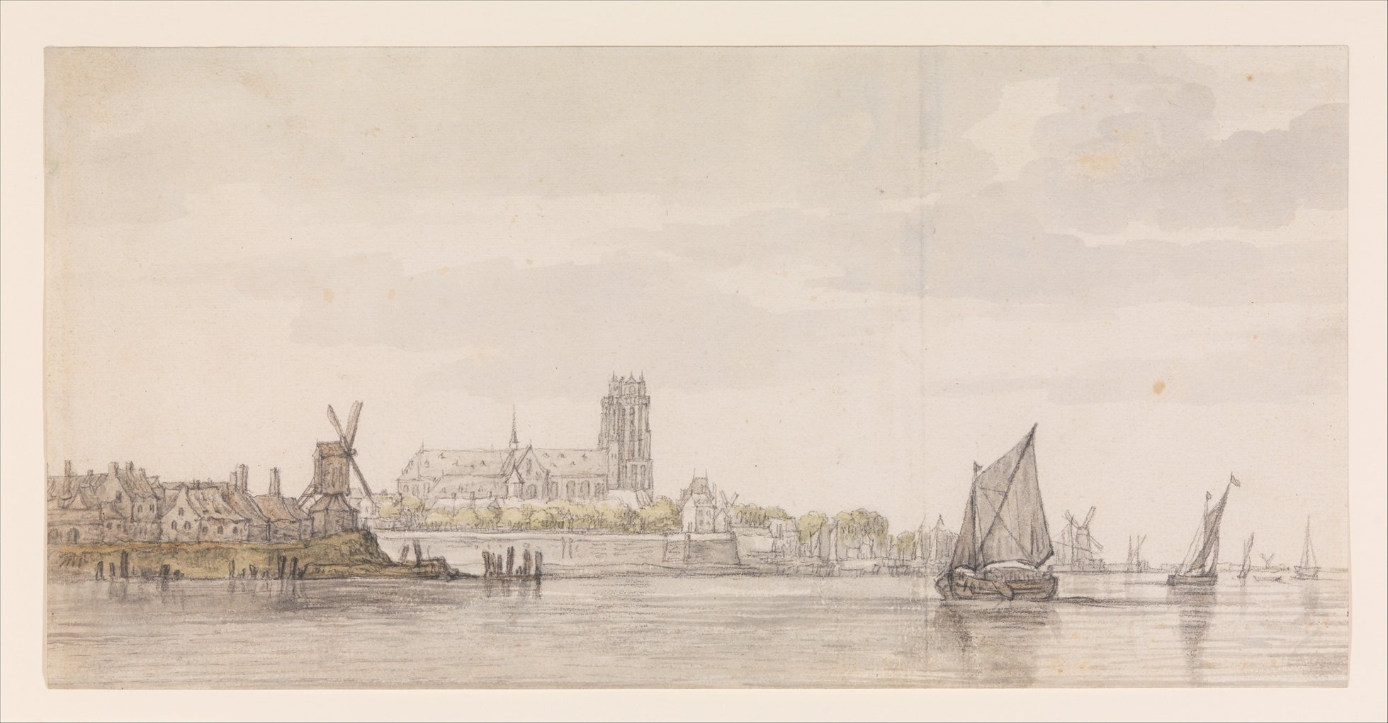
View of the Groote Kerk in Dordrecht from the River Maas
Aelbert Cuyp (Dutch, Dordrecht 1620–1691 Dordrecht) From the collection of the Met
Did you get a whiff of autumn in the air the other day? I certainly did, and memories of going back to school came flooding back to me. It's especially poignant because I'm going to be on the other side of the lectern this year teaching an evening undergrad class — Interaction and Communication — at the School of Visual Arts.
Why?
Why teach, and why now? I'll admit that for years I've considered teaching but I've often lacked the confidence and motivation to do it. As an introvert it was a scary prospect to have to stand in front of a group of people and capture their attention for hours at a time expounding on a topic. I always felt like I needed to be more of an expert...well, at basically everything. I've come to the conclusion that the feeling will never go away and it's better to interpret it as a desire to learn. Having to be responsible for someone's educational experience seemed like a huge burden that I wasn't ready to take on.
And that's exactly why this moment feels like the right time to teach. Given that many of these students will end up in the tech industry, what questions are they asking about what they're designing? These are the students that will one day be shaping the experiences of millions (if not billions) of people. Will they be asking the "for whom" and "why" questions, the really hard ones? Design shouldn't just be paying lip service to empathy. If designers are supposed to be user advocates, we need to do a better job as a discipline to consider those questions and be prepared to persuade our colleagues to stand behind them. Asking these questions from the beginning means we're making products, services and systems more humane - in the sense that we're making them for all humans, not just a small privileged subset of them.
And this starts at the foundation. Students need to get comfortable asking "for whom" and "why" from the beginning; of course the "how" is important, but the most beautiful app that has really clever interactions is abhorrent if it supports and enables harassment or discrimination. It's so important to understand how to critically think about the existing structures and systems around us and imagine different experiences and outcomes.
So yea basically I needed to get over my fears because this is so much bigger than me.
Preparation
At SVA there's complete freedom to build the course curriculum and set grading policies, and they believe that the most effective teachers are active practitioners in the field. On one hand that's awesome, the curriculum can emphasize what I believe are the essential principles in approaching design and I can choose exactly how to structure the course. It's also incredibly daunting to write a course from scratch - the first thing a friend of mine who's taught undergrad said to me is "don't write your own curriculum from scratch the first semester you teach, I really regretted that." Sooo what am I doing? Ignoring that advice. (Mainly because there *is* no standard course to base anything off of, every section is unique to the instructor.)
Derrick and I have been shaping the syllabus over the course of the summer and it reminds me a little bit of the process of doing a perspective drawing. Find the measure, mark off the drawing surface with the measure, and roughly lay out the structure. Then go back in and layer on details with increasing fidelity while keeping the whole drawing in mind - you never focus too much on one spot or it'll become unbalanced. But it's ok to not work up the entire drawing in excruciating detail, it's finding the right places to add that detail. You have to periodically fuzz your eyes out a little bit to see the big picture.
I've been considering the flow of each session but also how each session has to flow across the entire course. Does it all connect? Do the concepts in one build to the next? Where do the outlier topics go in the sequence? They're important enough to cover but stop the flow in some way. How early in the semester can I introduce a concept? Is that concept better conveyed through a lecture, discussion or exercise? Is this too ambitious for a semester? Rather than trying to answer those questions right away, we started with a rough outline of the semester and we've been moving, tweaking and refining the structure as we add a little detail to each session.
It feels very meta in that I want to do some user research on students before even writing this syllabus because creating a course *is* a design project. What level of knowledge can I expect? What are their work habits and attention spans like? What assumptions am I making about how they work? Leaning on educators for anecdotal evidence is what will have to suffice, for now. We'll iterate as we learn more about our students, so I suppose the syllabus in its current state is our MVP. I've also started questioning what my pedagogical beliefs are and that I don't really have a great perspective on that! So I've given myself some homework so I can feel a little more grounded in the why's and how's of teaching.
If anything this is forcing me to brush up on things I thought I knew, but from the perspective of explaining it to someone who has no knowledge or experience of the thing you're talking about. It's given me fresh eyes as I've been flipping through reference books and reading articles I saved forever ago. I've been considering what got me excited about being a designer and figuring out how to convey that excitement. I want them to walk away from this class feeling like they've only touched the surface and that there is so much possibility for helping shape the world around us in meaningful ways.
Ideas? Tips? Send them my way!
Thanks to my co-instructor Derrick Schultz who asked me if I wanted to teach this course with him and gave me the kick in the butt to say yes. I'm so grateful to all my friends and colleagues who have been involved in education that have put up with my pestering to give me tips and advice.
Daily Routine
Once in a while I review this “Daily Routine” list I made ages ago in a to-do app. I’ve never checked anything off of the list because they’re always in a state of “to do”. Doing items on this list help me stay grounded.
Push-ups
Karate or running
Cook something
Write something
Water plants
Draw/paint/sketch
Read something thought provoking or inspiring
Make space
Drink enough water
Eat vegetables
Get rid of something unneccesary
More than ever, I need this list. Too often I get sucked into the spiral of social media that feeds my sense of helplessness and, now, fear. I refuse to be paralyzed with fear. I refuse this helplessness.
What I *will* do is create and engage.

Shortbread: The Best Cookie
The best cookie!
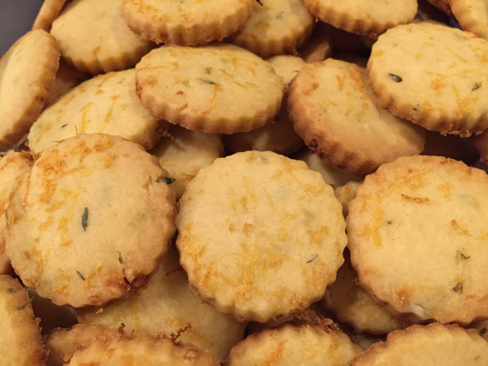
Lemon Thyme Shortbread Cookies
I’m a secret cookie hater. Ok, not cookie hater. It’s that I prefer cookies where you can actually taste something besides sugar. I'm also not big on the fancy icing and decorations, they always seem to be taste better than they look. So this year, for the annual Serious Eats cookie swap, I decided to make a shortbread that veers a little towards the savory and aromatic side. I couldn’t seem to find a definitive shortbread recipe that fit my ideal criteria - a little crumbly and not overly sweet - but came away with a few tips:
Using a finer-grained sugar like caster or confectioner’s produces a smoother texture.
I noticed that some shortbread recipes call for egg, but I decided it against it. I was afraid that I’d lose the crumbly texture and veer more towards a chewy cookie.
Adding a ton of lemon zest won’t hurt.
Try to find the best/highest quality butter you can. Wayne scored some kind of grassfed organic butter from Organic Valley with a high butterfat content that had that strong buttery smell when you open up the wrapper. I'd go for Kerrygold or Plugras as well. Since shortbread is made mostly from butter that’ll make a big difference in the end.
Use salted butter instead of unsalted to avoid the overly grainy texture.
Creaming the sugar is important, don’t skip that!
Lemon Thyme Shortbread
Yield: 72 1/2 inch rounds
Adapted from this recipe
Ingredients:
1.5 cups salted butter
1 cup powdered sugar
1/2 teaspoon kosher salt
lemon zest from 2 large lemons
2 teaspoons lemon juice
2 teaspoons fresh thyme, stems removed
3 cups flour
Procedure:
Mash the salt and fresh thyme with a mortar and pestle. The goal is to release the oils from the thyme leaves and to break down the kosher salt crystals.
Cream the butter and powdered sugar together. I used a KitchenAid stand mixer with the paddle attachment, but whatever floats your boat.
Add the salt-thyme mixture, two teaspoons of the lemon zest and lemon juice and turn the mixer back on low until these ingredients are incorporated evenly. Reserve the additional lemon zest for later.
Add the flour and turn the mixer on low to medium. It’s done when the mixture pulls up from the sides of the bowl and clumps on the paddle.
Wad the dough up into two equally sized flat discs. Wrap with plastic wrap and refrigerate for at least an hour. 6. Preheat the oven to 350 degrees.
Place the dough on a floured surface. Sprinkle some lemon zest on evenly as you roll the dough out to a 1/4 inch thickness. The rolling action will incorporate the lemon zest into the dough. Remember to use half the zest on the first piece of dough.
Cut out pieces at your desired shape and size and place on a baking sheet. Bake for 15 minutes, but be sure to check at the 10 minute mark. The edges should be golden brown.
Remove from oven and place baking sheet on a cooling rack. You can optionally sprinkle with a little kosher salt as soon as they come out of the oven for a salty kick.
Enjoy!

Editorial Design is a Team Sport
Where to Eat Chinese Food in NYC
screenshot of the final project
Editorial design on the web tends to manifest in two extremes: a one-size fits all “here’s a container, fill it with content” template and gorgeous one off custom projects (you’re probably thinking Snowfall right now, but there are some great ones here). The ability for a publisher to execute projects like that is affected by so many factors: available resources, dealing with the limitations of legacy CMS’s, the relentless pace of publishing. I admit that I’ve felt pangs of jealousy when I see great editorial projects (and admiration, of course)!
Often I look at our tiny Product team of two and think, how can we possibly achieve that level of quality and to make it useful more than once? (Haha try to justify the resources for a Snowfall-esque piece gives me anxiety) A voice in my head says don’t even try to go there.
Over time, though, I’ve realized that it’s not about having a huge team or a pile of money to pull it off. The secret ingredient to great editorial design is the effort that designers put into fostering a collaborative environment across disciplines.
1. Talk It Out
Every step in the process should facilitate communication. If you notice it doesn’t, throw it out, modify it or find a better way; there’s no excuse to say “that’s always the way we did it”. Designers, sorry to break it to you but the era of the “big reveal” is over. Slack (I know people go ON about it but it’s still worth saying) has become a key part of our process because we can quickly iterate on the idea by throwing ideas back and forth, there’s no need to wait for a formal meeting to get feedback. Constantly ask “How can we make this better? How can we make this more useful?” By working on everything in parallel — written content, illustrations, photos, design, code — the team is encouraged to communicate and make incremental improvements together.
Choose the design tools that best help convey your ideas. I recently picked up Sketch — not because it’s new and shiny — but because it’s trivial to create storyboards to demonstrate variations on interactions. When reviewing with the rest of the team, I could see a lightbulb go on in their heads that doesn’t happen with Photoshop comps. They asked more questions, pointed out holes in the interactions and started thinking about how their own pieces fit into the puzzle. Design work improves the more feedback we can elicit from our fellow team members. Constantly evaluate your toolset and choose the ones that are most appropriate for the task. Sometimes it’s a paper prototype and other times it can be a mockup in framer.js. Sure, it takes time to learn how to use new tools and methods, but the investment is worth it if it means your team more clearly understands what you’re trying to convey. And you need to meet your team halfway when asking for feedback; be specific about what you’re looking for and lean on their expertise.
2. Content is King! Or, Content Early, Content Often
That said, I’ve found that I can design theoretically in a tool like Sketch or Photoshop until the cows come home but I won’t know if it works until there’s real content paired with interactions. Designers need to push to get content into context as early on in the project as possible. Lorem ipsum is not your friend, your team is! New ideas and suggestions for improvements happen much more quickly when the whole team can see working interactions, so design in the browser as soon as the team’s agreed on a general direction. Set expectations with editors and writers to deliver at least a draft while you’re still exploring ideas.
And don’t assume that this guideline only applies to written content. This is critical for visual assets too, especially when responsiveness is a requirement. We had the luxury of hiring an illustrator for this project, but we hadn’t nailed down exactly how the illustrations were going to be used. We had the illustrator start a month ahead of time and requested files that would give us the most flexibility: largest file size possible, layered files, transparent background. That way we weren’t boxed in when it came to figuring out how best to integrate the illustrations with text across all screens.
3. Reduce, Reuse, Recycle
Editorial design often falls to internal teams to execute, and I see that as a huge advantage. Rather than having to start over from scratch on every project like an outside consultant would have to do, the team works towards building institutional knowledge and skills. It gives designers an opportunity to solve problems that are very specific to the workflow and content needs of both editors and readers over a much longer period of time. Smaller, incremental iterations help reduce risk and — perhaps counterintuitively — allow for greater experimentation.
Over time we’ve built up a library of custom tools, styles and code through projects like the United States of Burgers, beer map, gift guide and collections. Although at first glance they seem like one-off projects, we’re always thinking about reuse; everything the Product team builds is a springboard for future features and the most successful components can be rolled back into the main site. With a consistent feedback loop, the whole team can decide what looks like success and think creatively about what can be recycled.
4. Understand Your Limitations and Work It
Limited resources and a deadline can actually work in the project’s favor. It enforces discipline and a laser focus on the whole team, and goes hand in hand with principle #3. If the team’s been working together for a while it’s much easier to estimate scope. Strip everything down to the most essential (without cutting corners) and prioritize the features you’re going to release (or not). Reuse and steal like crazy from previous projects. And ask “Is this truly useful or are we being overly ‘creative’”?
Within these limitations, the product designer still needs to evoke empathy for the user in everyone on the project. As the intermediary you’re helping to negotiate the balance between the two. Give the Editorial team choices and consequences — “we can do this and this will be the effect, or we can focus on this and it would provide XYZ.” Too often, with no deadline and lots of resources, you can end up spinning your wheels with lots of experiments but nothing gets decided and consequently released. Use the limitations to help launch. The project will be that much stronger by empowering everyone to make the decision together.
5. Tear Down the Walls
Paul Ford’s recent post about the dress and Buzzfeed reinforced my belief that the first four points are worth nothing without establishing a strong culture, because honest communication can’t happen without building a level of trust.
One of the easiest ways of doing this is actually spending “non-work” time together. Parents — don’t worry, I’m not talking about spending all the free time you don’t have with your colleagues. Coffee or tea or a meal together away from desks during working hours can spark discussion. (Yes, this is Work with a capital W.) This is critical, I’m not joking : the more time you spend building relationships across teams so you can be honest with one another, the better it is for communication and thus the projects you’re working on. The team develops a shorthand for communicating that can only be built up over time, it’s not something that happens over night. It’s also about getting everyone excited about the aspect of the project they’re working on, and when you can see how your piece fits into the puzzle, everything clicks and you can move together towards the same goal. This should be taken as a team wide responsibility and not just the designer’s. Break down the walls between editorial and product! Change the culture!
Great editorial design is an artifact of Editorial and Product teams collaborating across disciplines and not based on resources alone. Designers are uniquely positioned to act as the glue across those teams. It’s a part of our responsibility to do this; in the end, isn’t our job ultimately about facilitating communication? We have to stop seeing our role as only addressing the needs of the “end user”, we also must invest our time into improving our working relationships to enable everyone on the team to produce our best work.
Thanks to the kickass team who I worked with on the Best Chinese Food in NYC project and served as inspiration for this: Max, Paul, and Vicky!

Thanksgiving 2.0
Thanksgiving overhaul
Seasonal content always gives us an opportunity to improve the design and functionality of the site. (Compare to the Topics page design from the year before.) [link]
Last year the product team focused on just getting *something* together for Thanksgiving on a tight deadline, but this time we had the luxury of an existing code base to work with, a year's worth of experience making these pages, and a much longer lead time. One of the things that I really enjoy about working on a site with lots of evergreen, seasonal content is that I have the opportunity to revisit ideas, put gained knowledge into practice and make improvements. We decided to focus on integrating a new visual design language, refactoring the existing code and improving the editorial workflow.
Over the summer we worked with a design firm on a new visual design for the site. Updating the Thanksgiving section was the perfect time to execute the new look and feel and build our stylesheets from the ground up because it's mostly self contained. The current site relies on Bootstrap, but it's been feeling too kitchen sink-y and I often find myself overriding many default styles that I didn't need in the first place. I chose Bourbon after evaluating other frameworks like Pure and Foundation as it seemed the least obtrusive and most flexible. Although there was a bit of an adjustment going from LESS to Sass, I'm happy that I made the switch. Bourbon (and its related packages) has a tiny footprint compared to Bootstrap and the extends and syntax help keep the project more organized. Semantic naming for layout and columns is supported and the responsive grid is easy to modify. I set up naming conventions based on SMACSS principles, which should allow us to scale the stylesheet more easily and enable others to jump in and contribute with more consistency. Moving towards packages managed on the command line will enable us to keep the framework at the most up to date version.
We also refactored the template code with what we've learned over the past year by chunking out blocks of functionality for reuse in other areas. Just as we're approaching the visual design in a more modular way, we've been creating patterns with context based rules.
Lastly, we set up a new way of collecting questions from readers. Rather than just soliciting questions in comments or Twitter, we set up a form on the Thanksgiving landing page It was important to build a solution that fit into the existing editorial workflow, as the editors would be more likely to use it since it's less cognitive time spent on learning something new. Considering the size of the Product team (two!!) it was also imperative that we follow the path of least resistance and quickest implementation.
When a reader submits a question, Formstack syncs the submission to a Google sheet. An editor reviews and copies approved questions into the master spreadsheet, and a script exports the data as a JSON file on the server. Google spreadsheets are already a part of the daily workflow and the data can be easily updated with a single command. We had used this technique in previous projects inspired by this solution, but this time we made it into a reusable script customized for our environment and data. (And we were heartened to know that other publishers are using a similar technique!) We're excited about using this for an upcoming gift guide and ideas that require more flexibility than our current CMS allows. One tradeoff of flexibility that we've run into is that the process can be prone to error; we can't lock down parts of the spreadsheet that are crucial to exporting the JSON file (column headers, anyone?), so we'd have to think about error handling to make this process scale better.
The biggest takeaway, for me, is how tightly visual design and front end development have become woven together; in fact, I don't really see much separation between the two. Projects are most successful when they're taken through an iterative process and it's especially crucial for responsive design, where I need to see it in action before I can decide whether or not it works. And overhauling a limited area of the site is much less risky and allows time for testing. It also gives us the opportunity to refine the design because we can see it in the wild and get feedback -where does it not work? How can it be improved? Where can we take chunks of design and code and make them reusable in other places? Ultimately I hope that the experience we've put together will help improve everyone's Thanksgiving game!

In Need of A Haircut
Last month we launched some updates to Serious Eats - the site hasn't had a major visual overhaul in a few years, and we wanted to address some immediate issues while working on a larger reorganization and redesign project in parallel. We weren't adding any new features, if anything we were focused on paring down and identifying what could we do based on what already existed.
The percentage of visitors on mobile and tablet devices has steadily increased and, although our overall traffic has been going up, the time spent on the page has slowly been decreasing. A few years ago we had experimented with a mobile site that served stripped down pages from a mobile sub domain. It became neglected as it was a completely separate set of templates, which meant double work to keep feature parity. We wanted to stop using the "mobile" templates, make the existing design responsive and have one canonical URL for any given piece of content.
Going responsive was an immediate fix, with the goal of increasing the time spent on page and more pages per session. But going responsive for a publishing company doesn't just mean adding media queries to the stylesheet. We had to consider how advertising was going to be integrated at various widths. We settled on using an asynchronous loading method so we could load the correct size depending on the screen width. And given the timeframe, we settled on a single breakpoint at 768px. To solve for the less than ideal width in portrait view on tablets, the viewport metatag is omitted to force the viewport to zoom out to display the (wider) site within the screen. It's a handy hack!
The site was also badly in need of a cleanup; over time, pages had become cluttered with unnecessary widgets, colors and scripts that were just adding visual noise and slowing the page down. There was also a proliferation of styles as various projects were launched, and we wanted to make the styling more consistent across the board. Internally we dubbed this project "the haircut". We wanted to get out of the way and let readers read!
And finally we had to change our templating system. (Not a small task, props to Paul!) We had already built a number of projects with ChApp and we were finally ready to cut the cord with using Movable Type to render pages. MT is now set to publish JSON feeds while ChApp handles all the rendering logic. ChApp gives us more flexibility and we no longer need to rebuild the entire site, we just push the templates via git and restart the server only if settings have changed.
But we had to do it in two stages: first recreate every template in ChApp that mirrored the old blog structure, then we worked on consolidating the templates. We now have a single template that renders stories and one that renders recipes; we previously had one story template per blog. There are still a few dynamic templates like user profiles and registration that MT handles, but for the most part we're now on a much more flexible platform where we can make changes much more quickly and easily. It cut our launch time down to about an hour - compare that to the last major update, which took four or five hours and then a site rebuild over another day or so. And it gives us the ability to make much quicker releases rather than having to wait to rebuild the site to reflect any changes.
So the big question is: how effective has the haircut been? It's consistently more than doubled the time on page and decreased the bounce rate by about 10%, and the page load time has decreased on average by 4 seconds. Readers are thrilled that the content is optimized for reading no matter what kind of device they're on.
For the future, we want to continually focus on performance. For instance, we want more control over displaying images so we can serve the appropriate size according to bandwidth and screen capability. We're also in the midst of a larger taxonomy project to dramatically improve the search experience, especially for recipes. And we're making a bigger effort to surface evergreen content - we started doing this with a custom-built related content widget at the bottom of posts - and will extend to bigger projects like what we've been doing with our holiday collection pages. So stay tuned!

Making Sandwiches
I do admit that I get to work on some fun stuff at Serious Eats. The process for building the sandwich page was a great example of a successful collaboration between editorial and the design/dev team. It was a quick process - Kenji came to me and Paul with the idea on Monday afternoon and we had launched it on Friday. Over the past six months we've modularized a lot of our code so it's pretty easy to drop components in without having to worry if they work or not.
Kenji showed us an idea he had for a sandwich graphic - he wanted it to be more interactive and possibly with some animation.

Talking through, it seemed like it was a bit more straightforward than the maps we've done in the past, plus we had some code that we had already written that could be reused for this project.
First I created quick and dirty comps in Illustrator to establish a clear look and feel. I've switched to Illustrator recently after having been a die-hard Photoshop nerd when it comes to comps - I love the multiple artboard aspect, it's perfect for working on proposed interactions at various screen sizes. I wanted the sandwich layers to pop off the page, but have a more refined sense of typography that I've been trying to work into some of the seasonal pages and maps. I focused on organizing the layout in a way that would make responsive aspects easier since we knew we had a tight deadline.
Kenji had also prepped all of the photography ahead of time into transparent layers, so it saved me an enormous amount of time when it came to prepping the artwork for use in the page. I exported each layer of the composite Photoshop file into a png so that we could wrap the img tag with a div, assign a unique class name, and independently manipulate each layer with javascript.
Paul looked at a number of animation libraries and he chose animate.css. It's lightweight and comes with a number of nice CSS transitions. CSS transitions seemed the way to go for animations since they're supported in modern browsers. The content was collected in a google doc spreadsheet. That way Kenji could make a custom data structure, add and change content as he went, and have other editors review. All Paul had to do was match the data structure on the front end, export the sheet as JSON and drop it onto our static server. This is a piece we'd like to automate a bit more at some point though.
This was the perfect project to take advantage of the programmatic aspects of LESS to make the CSS writing faster and trivial to update. Each layer of each sandwich has a slightly longer delay than the next, so it was pretty straightforward to write a loop in LESS to output a series of numbered classes. I could also reuse the LESS mixin to make another set of classes for each sandwich. [Check out these sweet gists of the LESS mixins and the compiled CSS!]
By mid day Wednesday we had a working prototype and we got some feedback from Kenji - there was additional content I hadn't accounted for. The next day or so we worked on incorporating the feedback, making the page responsive and squashing bugs. Surprisingly we had very few browser bugs, it was certainly more about getting it to look great across the range of device widths. Getting the breakpoints right is still a bit tricky, but this page was simple enough that I could adjust the breakpoints on the fly, directly in the CSS, rather than having to go back and do more refining in Illustrator.
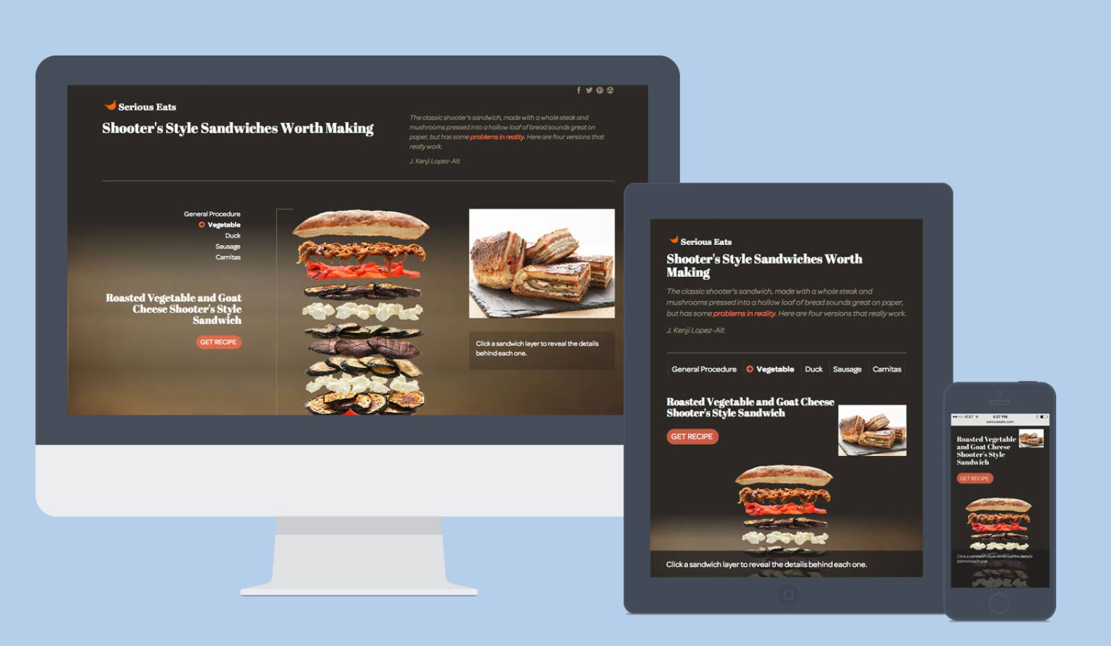
And voila, Friday we launched!
The feedback we received was enormously positive and we're hoping to do more and more of these collaborations in the future.
I Want a Better Writing App
[Note: I wrote this a week before Writer Pro was released! And guess what! It's taken me that long to publish it!]
I write on my phone a lot. For pleasure, to get ideas out, to work things through, to produce, to share. But none of the apps I've tried actually address the process of writing. Sure, I have maybe weird requirements in that I do most of my writing on the subway so I have no internet. (This is when I am least distracted and I can just...write.) I edit things over a few days before I publish rather than being spontaneous. And I tend to do a first pass at editing on the phone and then I move to the desktop if I want to be more ruthless. (Tap/hold/drag only gets you so far.)
So many of the writing apps I've looked at are only concerned with the interface around the writing part and making it beautiful/minimal. Cool! I think y'all have gotten that done. But I need a tool that can help me refine my writing and prepare it for publishing. (I am *not* asking for a tool to actually publish!!) and I mean "publish" in a loose way. It may be for private or public consumption. Sometimes it ends up in an email, sometimes on a web page, sometimes in a (gasp!) a PDF. Sometimes I want it to go to one of my numerous Tumblrs or my personal blog or my business blog. Sometimes it just ends up being notes for myself. Products like Editorially and Draftin are great...but, no internet. So much of my writing ends up languishing in this phone's local directory. (If it's a blog post that's never published, is it a blog post?)
I know it is not easy to design and produce an app! However, I have some suggestions to writing app developers for my weird/selfish use case:
Modes: Draft/editing/to publish/archived. I have a huge directory of text files and I have no idea what is in what stage. Tagging? Toggle? Some way of organizing.
Also the ability to associate more metadata please.
Time shifting! Auto sync: queue my text file for syncing to my chosen publishing tool for that particular piece of text the next time there is a connection. Not just Dropbox. Bywords has a feature that is similar but I don't use any of those services. Make a service-agnostic option (JSON...? Hell, Markdown). Harder said than done, obvs.
Saving to Dropbox/"the cloud" without creating an error when I don't have an internet connection (I'm looking at you, Writing Kit). I've had to resort to emailing unfinished text files to myself with my current writing app and the lack of versioning is driving me up a wall.
Nag/nudge notifications: it be GREAT if my phone gently reminded me of something that's in draft mode. "Hey, looks like you haven't worked on that in a few days. Wanna take a another look? Or have more ideas?" Sometimes I just need a few days to think something over and let it percolate, but sometimes I just...forget. And then I look in the app a month later and I'm like, WHY DID I NOT FINISH THAT.
Personality: following up on the previous item, give the app some personality. (You don't need to go all Clippy the Paperclip though). I'm not a professional writer by any means, but I enjoy writing and will take all the encouragement I can get.
Bonus: Associating photos: Nothing fancy. But hey - I've got this photo of a prototype I was working on that would be perfect for the post. Associate it with the writing please!
That said, please make it focused. I don't need to be presented with 500 options all at once. Step me through the tasks - writing/editing/publishing - in a way that makes it easy to understand.
Lastly, yes I would pay good money for this and think others would too.

Experience Isn’t a Dirty Word
Observational Sketch, Süleymaniye Camii
July 2010, Istanbul
A piece that I read on Medium recently called "Experience Slows You Down" kind of bothered me for a while. I agreed to some extent that experience doesn't automatically make you an expert. However, the author misses the point that experience is valuable when it's done with intention and attention. I'm reminded of two principles in karate that I return to often - shoshin, beginners' mind, and renma, the act of polishing.
Shoshin is akin to what the author described in his piece. I try to approach every project as if I've never done it before. It doesn't matter if I'm doing kata - a series of predefined moves - or working on a site design, or planting a garden. The worst thing that I can do is to say to myself, "oh hey I know this already so it's all good." I run the danger of making the same mistakes, doing things by rote and not actually solving the problem at hand. Maintaining my awareness is what's crucial, not that I've never done it before.
For the month leading up to earning a black belt, you're asked to switch back to a white belt and attend white belt class to remind oneself of what it felt like when one started and had no preconceptions. When I start with beginners' mind, I'm often led to insights that I would have missed otherwise. I try to keep curiosity and playfulness at the forefront and realize that the more I know, the more I find out that I don't know.
Experience becomes valuable through the concept of renma, or constant polishing of technique. Take whatever the essential building block of the medium is - a punch, sketching from observation, setting type, practicing scales - and do it ad infinitum. A deeper understanding and skill level gradually develops through repetition. Since last year I've hand-rolled thousands of tortillas. To some it may appear to be drudgery. But through doing it with attention, I now know exactly how hot the grill needs to be, what the optimal temperature the dough should be for rolling, and how long it takes for the dough to puff up to fluffy perfection. I wouldn't have been able to acquire this information any other way as it's a long process of trial and error. But now I can be confident in our choices for a permanent set up that will give us tortillas of the same consistency, taste and quality. In doing things like this, I aspire to even a thousandth of the skillfulness of a chicken yakitori master we had encountered in our travels in Tokyo - a man, well into his 60s, who effortlessly and gracefully rotated skewers with the flick of his wrist until each piece of chicken was charred to perfection.
The great artists and designers that have left a cultural legacy understood these principles. They weren't geniuses who were born fully formed, they worked extremely hard at their craft and had the ability to have an open mind that enabled them to come up with interesting, insightful ways to communicate. I was just reminded of this with some of the watercolors that were on display at the JS Sargent show at the Brooklyn Museum - you can see a huge difference in the mastery between an earlier, tentative piece and the Carrara quarry paintings a decade or two later. I'm inspired all over again to put these principles into practice.
It's the intersection of beginners' mind and polishing technique that I believe one has the ability to achieve a deeper understanding and that creative solutions come about. And by no means do I think this is easy to achieve! It's something I strive for every day but I know that my attention wanders. Often.

Mapping Burgers
I've been really excited about the projects that I've been working on at Serious Eats, and the burger map that we published yesterday is a great example of how the design and development team has been working closely with editorial to rapidly produce new areas of the site to showcase Serious Eats content. One of the things that I love about Serious Eats is the deep archive of writing about all things food, but it's always been hard to find and surface (for a number of reasons which I won't get into here).
Kenji and the editorial team came to us at the beginning of June with an idea for a burger map for the Fourth of July; they'd choose 50 burgers and gather links and photos to previous recipes and reviews. They had a vague idea that it should be clickable but beyond that it was up to us. We told the editors to gather their data in a Google spreadsheet for now, since they're used to that workflow already, and I dove into design.
Two early conceptual sketches in Photoshop
These days I'm using Photoshop just for rough sketching rather than fully fleshing out the entire design, which has been a major sense of relief for me. The aim is to convey overall look and feel in the vein of style tiles rather than making specific layout choices or details. For those that argue that jumping right into CSS kills creativity, I would counter that it provides a set of constraints that one must be creative within. I know what's possible and where I can push the limits. It frees me from doing theoretical finished comps in Photoshop that would never work in the real world; so many of the issues that need to be solved with a responsive design only come to light as you interact with the page, and there is no way you can see that with flat comps. And we didn't have much finished content to work with since we were working in parallel with the editors.
Development-wise we had recently built NearMe as a way to explore and organize location-based content, but this wasn't quite the right tool for this project. However, the templating system that 29th Street Publishing had put into place was exactly what we needed. On top of that, we found a script for exporting a Google spreadsheet to JSON and an svg library called Raphael.js for the map. The script enabled the editors to continue their workflow undisturbed and we didn't need to build anything custom to store the data; maybe it won't scale if we're doing many maps a week, but we just needed to ship it quickly.
Now we've got a reusable base of design and code that we can spin off into other projects and a better idea of where we can take things. I definitely want to explore more mapping possibilities with MapBox, Leaflet, and OpenStreetMap (this is a really inspiring example!), as I think it's an effective way to group content to tell a larger story. And I finally feel like I'm getting comfortable with the process that responsive design requires to tackle some larger changes on Serious Eats.
Ever forward!
Prototyping and Lonestar Taco

Back in April I attended the TYPOSF conference (which I highly recommend) and one theme that ran through a lot of the talks was the move towards a rapid, incremental prototyping process with a collaborative team. Developing and running Lonestar Taco has been a very similar process. I'm mostly used to designing in the medium of the web, so it's been an interesting change of pace to work on systems in a more physical realm.
The same principles apply regardless - gathering and defining requirements, designing solutions, implementing, gathering feedback, iterating. This time though it's entirely our vision, and it feels a little funny to be in the client chair at the same time as the designer role. It's definitely harder to get perspective, so it's even more important to listen to our customers.
New Amsterdam Market gave us a chance to roll out our prototype, from the menu, the organization of the ordering line, food prep and cooking logistics, pricing, sourcing, even our social media. Every week we assessed how things went and took note of what we could improve. Sometimes it was something as simple as positioning the cooler parallel to the grill rather than perpendicular. Other times, it was realizing that propane tanks don't do so well in really cold weather and figuring out how we could adapt. We ended up creating a line of retail products that didn't require on-site cooking and selling tamales that could be kept hot on an electric induction burner.

As in all prototyping, we gathered as much customer and team feedback as possible. We had many variables to take into account - how much was rain responsible for variation in sales? How could we increase our capacity while decrease wait time but not sacrifice quality? And how could we ensure that we were meeting our bottom line? What items were the most popular and did we price them right? There's very thin line between customers feeling like they received value for their money and being perceived as too expensive. We also made sure to talk through feedback from our team, and they always had insightful suggestions that allowed us to make incremental improvements every day.

Although we've always been clear about our overall vision for Lonestar, it hasn't always been easy to figure out the immediate form that it should take. After last season, we collected a ton of information that is helping us with the next iteration. We're altering the design of the menu and offerings to make it easier for customers to make decisions and to streamline our service. We're focused on securing a permanent kitchen for ourselves - although the initial outlay will be larger than last season, the gains in our ability to produce food, hire staff and making our products more readily available to our customers will enable us to be a sustainable and profitable business.
Another point from the TYPO conference that resonated with me was the fact that nothing is ever "done", you always have opportunities to improve. And that has been so true with Lonestar Taco. Of course we all have days where we felt like we fell short but it was most important to get our idea out there to give people a chance to kick the tires. I'm excited that we're returning to New Amsterdam Market this Sunday to put some of our improvements to the test and to see all of our regulars.
Why I’m a Designer
Whenever I tell people who know me as a designer that I'm working on a restaurant, I get some puzzled looks. "Don't you make web sites or you're in tech or something?", their expressions seem to say. Yes, and the web is simply a medium. What I'm fundamentally interested in as a designer is the experience that people have when interacting with one another and how the intermediary systems can help or hinder those interactions.
Restaurants and the web are more similar than you'd initially think. Paul Ford pointed out that the web is a customer service medium - so is a restaurant. Everyone has their opinion and certainly doesn't hold back. (see Yelp and every food blog ever.) It's not called the hospitality industry for nothing! Ultimately you are accountable to your users/customers, because they will certainly vote with their feet if they don't like what you're doing.
The same questions arise in both mediums. What happens when someone uses an interface I've designed? How does the person on the receiving end interpret it? Was the message communicated successfully? The design process provides a set of tools to gauge success and come up with solutions to make improvements.
For instance, we want to offer counter service in the morning and afternoon and then switch to table service in the evening. This decision came about after observing that our potential customers modify their eating habits depending on the time of day. In the morning and for lunch it's mostly people on the run, in between activities or on their way to work. In the evening, people are unwinding and socializing, they certainly don't want to stand in line. However, switching service modes is unusual for most restaurants and there isn't a shorthand way to convey that.
How can we design the space and signage to be flexible enough to switch between the two modes of service and to make it clear upon a glance what to do when you enter the space at any given time? I constantly have to examine the interface and imagine the experience from the other side. Honing my sense of empathy is an essential part of being a designer and part of why I was attracted to the discipline in the first place.
When I think about a restaurant as a number of interlocking systems, I get ridiculously excited. A menu seems simple but it's not at all! It's not just the visual design of the menu, it's how the items on the menu are broken down into their components, how the prep kitchen organizes the production of those components, where the components are sourced from, if those items are even seasonally available, how to price the menu item, how the item is described on the menu, if customers understand what the item is, and the placement of the item on the menu. All of these things can be implicitly or explicitly communicated to customers and will color the overall experience. And tweaking any of these variables could drastically affect how well any given item sells, and making decisions based on collecting data and feedback can make or break the business.
Without a doubt I love that the design process fosters a spirit of collaboration. A tight-knit team that has good lines of communication is required for all of these projects regardless if it's a web site or a restaurant. The best projects happen when everyone feels empowered to make a significant contribution, and the systems you've designed are nothing without a team behind it. Design brings observation, empathy, and collaboration into a single process where we can put something worthwhile into the world. In the end, the form isn't as important as the relationships that these systems help build.