Making Sandwiches

I do admit that I get to work on some fun stuff at Serious Eats. The process for building the sandwich page was a great example of a successful collaboration between editorial and the design/dev team. It was a quick process - Kenji came to me and Paul with the idea on Monday afternoon and we had launched it on Friday. Over the past six months we've modularized a lot of our code so it's pretty easy to drop components in without having to worry if they work or not.
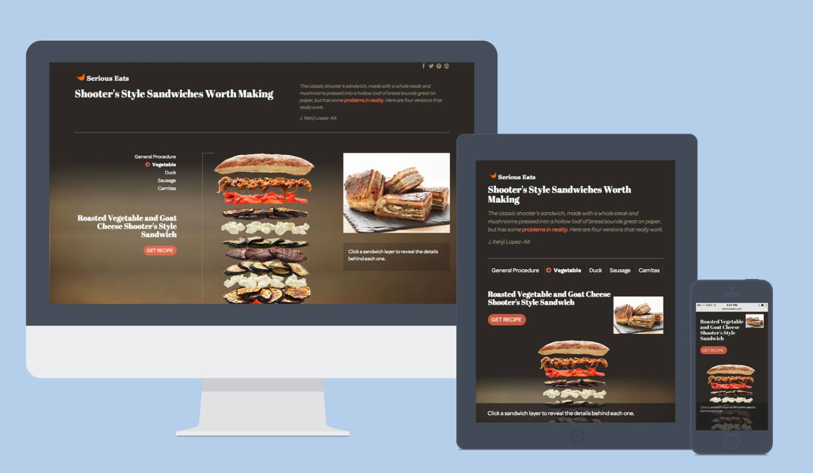
Kenji showed us an idea he had for a sandwich graphic - he wanted it to be more interactive and possibly with some animation.

Talking through, it seemed like it was a bit more straightforward than the maps we've done in the past, plus we had some code that we had already written that could be reused for this project.
First I created quick and dirty comps in Illustrator to establish a clear look and feel. I've switched to Illustrator recently after having been a die-hard Photoshop nerd when it comes to comps - I love the multiple artboard aspect, it's perfect for working on proposed interactions at various screen sizes. I wanted the sandwich layers to pop off the page, but have a more refined sense of typography that I've been trying to work into some of the seasonal pages and maps. I focused on organizing the layout in a way that would make responsive aspects easier since we knew we had a tight deadline.
Kenji had also prepped all of the photography ahead of time into transparent layers, so it saved me an enormous amount of time when it came to prepping the artwork for use in the page. I exported each layer of the composite Photoshop file into a png so that we could wrap the img tag with a div, assign a unique class name, and independently manipulate each layer with javascript.
Paul looked at a number of animation libraries and he chose animate.css. It's lightweight and comes with a number of nice CSS transitions. CSS transitions seemed the way to go for animations since they're supported in modern browsers. The content was collected in a google doc spreadsheet. That way Kenji could make a custom data structure, add and change content as he went, and have other editors review. All Paul had to do was match the data structure on the front end, export the sheet as JSON and drop it onto our static server. This is a piece we'd like to automate a bit more at some point though.
This was the perfect project to take advantage of the programmatic aspects of LESS to make the CSS writing faster and trivial to update. Each layer of each sandwich has a slightly longer delay than the next, so it was pretty straightforward to write a loop in LESS to output a series of numbered classes. I could also reuse the LESS mixin to make another set of classes for each sandwich. [Check out these sweet gists of the LESS mixins and the compiled CSS!]
By mid day Wednesday we had a working prototype and we got some feedback from Kenji - there was additional content I hadn't accounted for. The next day or so we worked on incorporating the feedback, making the page responsive and squashing bugs. Surprisingly we had very few browser bugs, it was certainly more about getting it to look great across the range of device widths. Getting the breakpoints right is still a bit tricky, but this page was simple enough that I could adjust the breakpoints on the fly, directly in the CSS, rather than having to go back and do more refining in Illustrator.
And voila, Friday we launched!
The feedback we received was enormously positive and we're hoping to do more and more of these collaborations in the future.